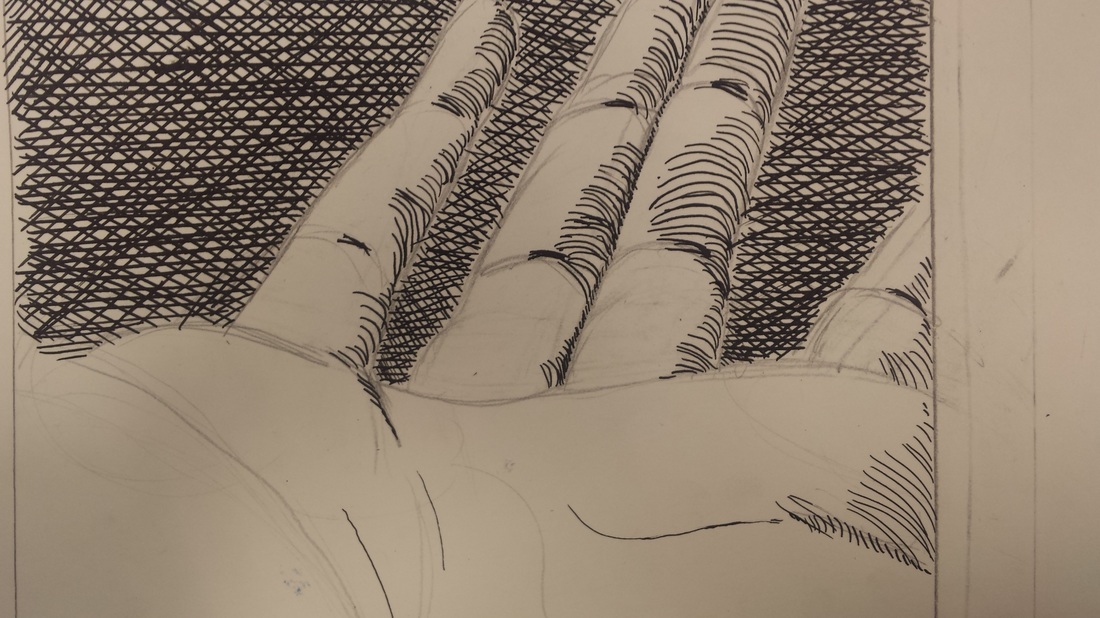
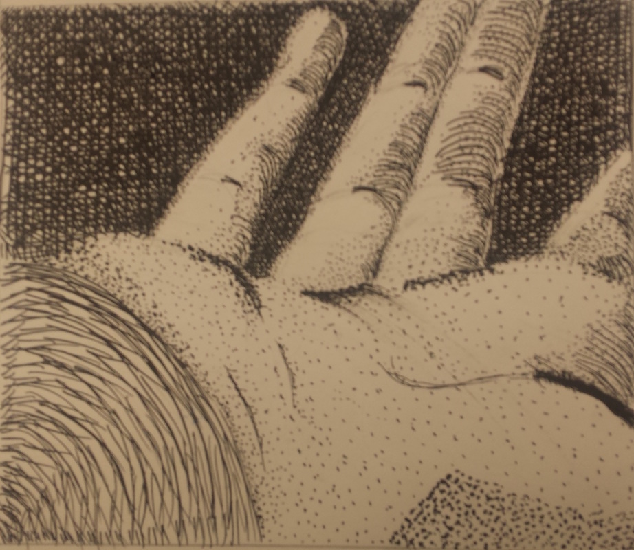
  My picture is a close up in drawing of a hand. One of the new skills i learned from this picture was how to create value in my drawing, which also happens to be one of the main art elements. I used value to make the hand stick out and draw the eye to certain places. The main design element I used was proportion. Since the hand is at a very odd angle, I used proportion so people could still identify what it is. Overall, I think it has a sort of "organized chaos" feel to it.
0 Comments
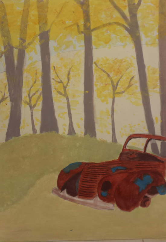 This is my landscape painting. I used acrylic paint to recreate an image I took (which you can find on my working blog). The scene is of a car in a fall forest. One of the main skills I learned was how to create space and texture in my painting. I also used the art elements of line, color, and form. I used line direction for the trees and backgrounds (the trees are vertical lines while the background is horizontal), form to create a three dimensional space, and color to create contrast. The design elements I used were contrast and proportion. I used contrasting colors when painting the car (red/orange with blue) and proportion with the middle ground, foreground, and background. The painting is a bit ironic because the car is destroyed by nature, but cars are advertised to be resistant to the elements.
|
AuthorI love soccer, my favorite color is green, and my favorite animal is a sea otter. Archives
February 2016
Categories |
 RSS Feed
