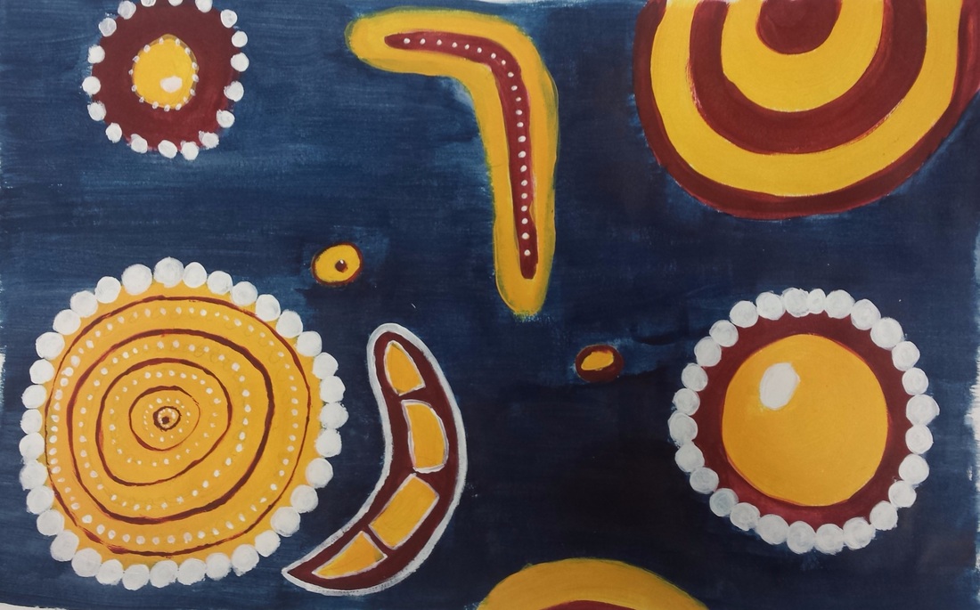
 This is my dreamtime painting, in which I used acrylic paint. I incorporated the design element of contrast by using contrasting colors of orange and blue. I also made the background a dark blue, and everything else lighter to make it stand out more. The art elements I used include line and color. I used different types of lines to give the picture variety. The picture is supposed to represent an individuals memories. The blue represents the brain and time while the yellow and red objects represent memories and lessons from the past. In the end, the painting has a hopeful, happy feeling.
0 Comments
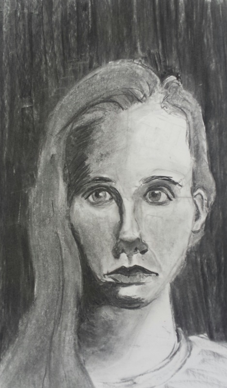 For my independent project, I decided to remake my self portrait. I wanted to remake the portrait to give it more value and to get the proportions right. I used vine charcoal on a 18in by 24in piece of paper. The main thing I learned was how to create form and value. If I could improve anything, I would make the nose and forehead smaller. I used contrasting values, black and white, to develop a more three dimensional shape. I would say it has a serious feel to it.
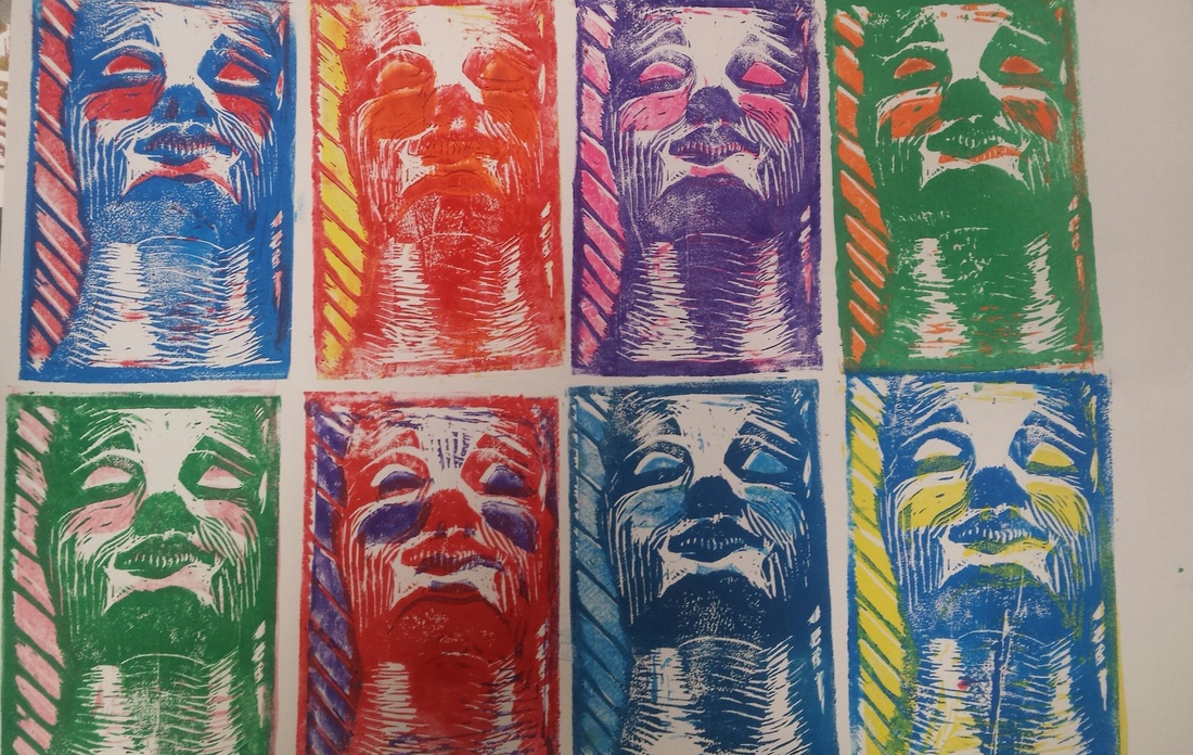 This is a block print of a face looking up. I used a rubber block to carve out the picture and ink to print it. One of the main things I learned from this project is how to use (and carve) negative space. The main art elements that I used were color and form. I tried to use direction and type of line to create a three dimensional face. I used color in to develop contrast, a major design element. An example of contrast can be found in the top left corner, where I used a warm color background to make the blue "pop". Overall, I would say the block print has a warm feeling, with a little bit of hope mixed in.
|
AuthorI love soccer, my favorite color is green, and my favorite animal is a sea otter. Archives
February 2016
Categories |
 RSS Feed
