|
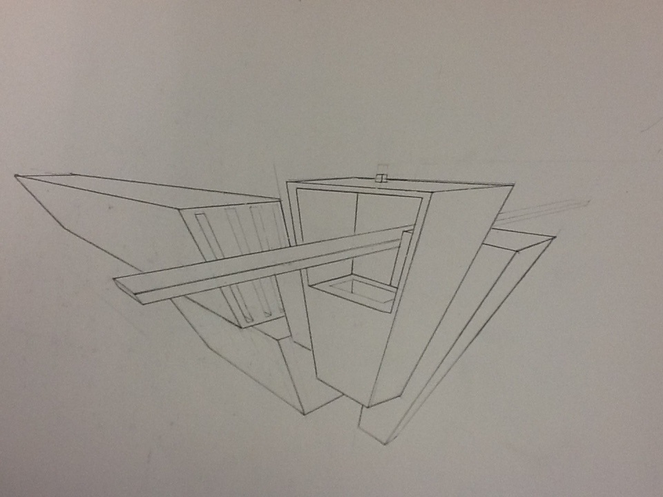
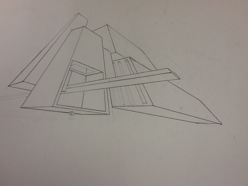
I used paper and pencil for my three point perspective drawing. The drawing focuses on line, space, and proportion. I attempted to make the lines darker towards the front of the page, and lighter near the back to give the drawing a sense of space/depth. I also tried to make the drawings closer to the viewer bigger, and smaller if they where farther away. Overall, the drawing has a very stable and realistic feel to it.
0 Comments
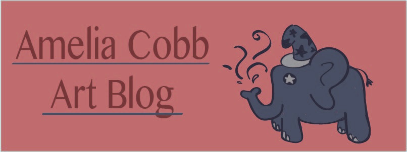 I designed my header with Sketchbook on the Ipad. The main art element that I used was color, and the main design element that I used was contrast between the background and the elephant. I wanted my name to stand out the most, so I made it a dark red, with a big brush size. Personally,I think it feels positive and potentially magical.
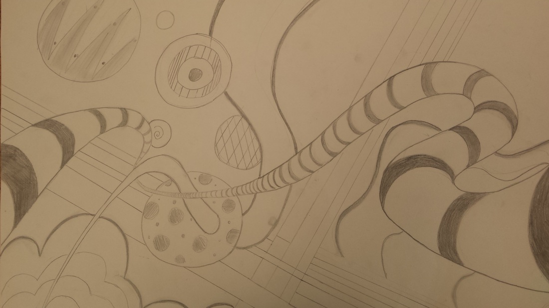 This is my line drawing. I used pencil on paper to try and create something that looked 3D in a 2D space. I used different types of value , line, and space to make the drawing. I applied a stronger value to make objects appear closer to the viewer, and a lighter value to make lines seem farther away. The thickness and thinness of some lines also help develop the 3D space. Also, I learned to overlap certain objects to make the drawing more interesting and give the drawing more depth. One of the art principles of design that I used was movement. The mood of this drawing is flowing, mellow, and a bit calming.
|
AuthorI love soccer, my favorite color is green, and my favorite animal is a sea otter. Archives
February 2016
Categories |
 RSS Feed
