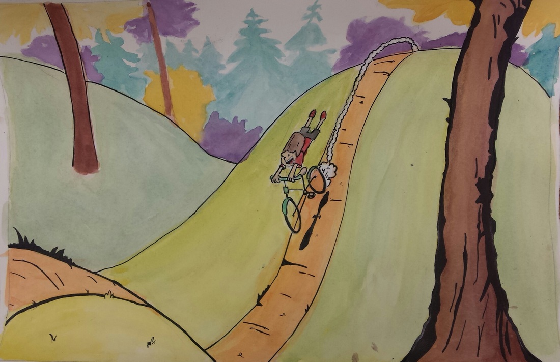
 This is a watercolor and ink landscape inspired by Bill Watterson's "Calvin and Hobbes". I learned how to properly use and mix watercolors. Some of the most important art elements I incorporated were texture, color, and a tiny bit of space. Texture helped define the tree and pathway, giving it a more detailed look. The painting was inspired by my childhood, as I used to ride my bike down a hill next to my house. I also read a lot of "Calvin and Hobbes", so it has an overall nostalgic feel for me.
0 Comments
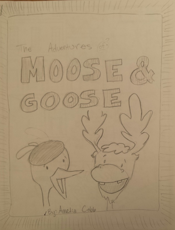
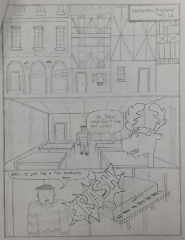
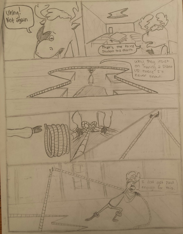
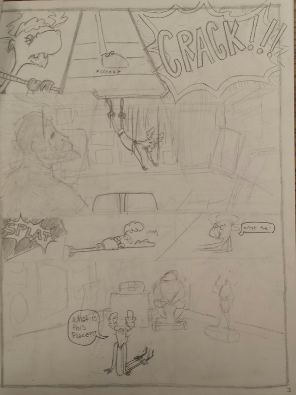
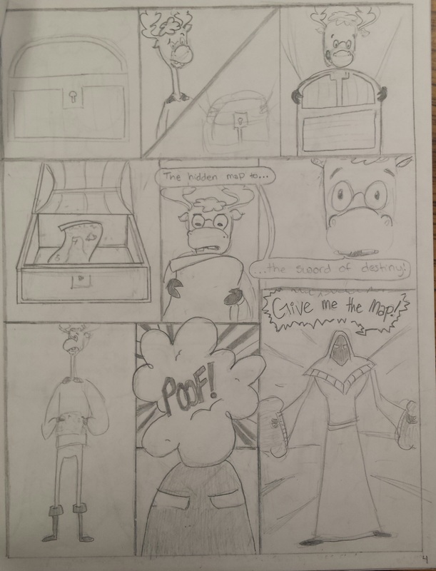
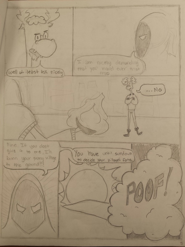
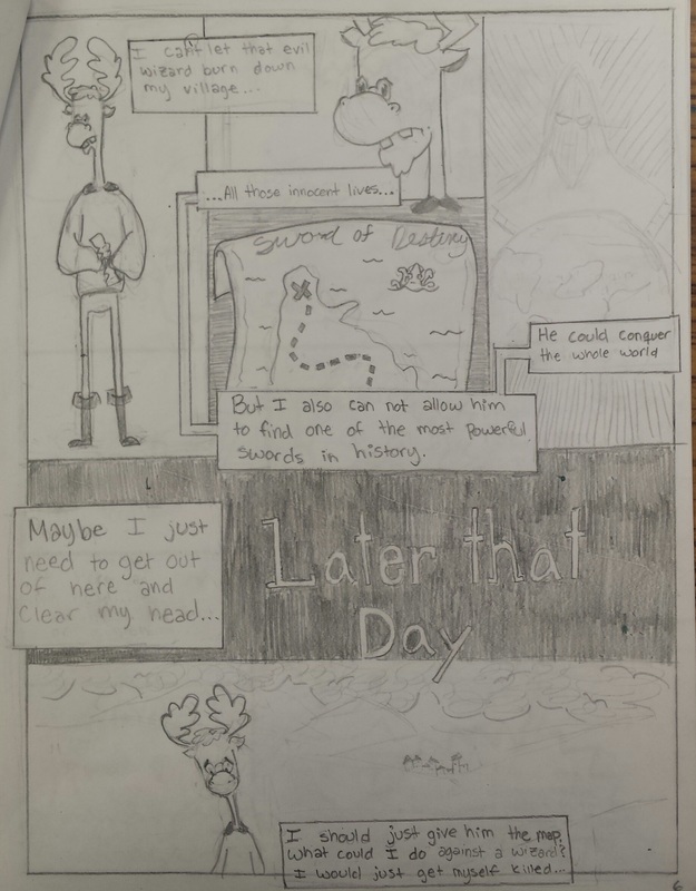
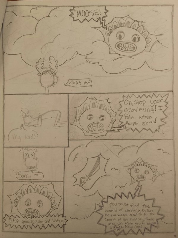
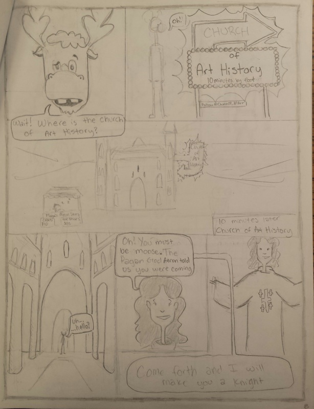
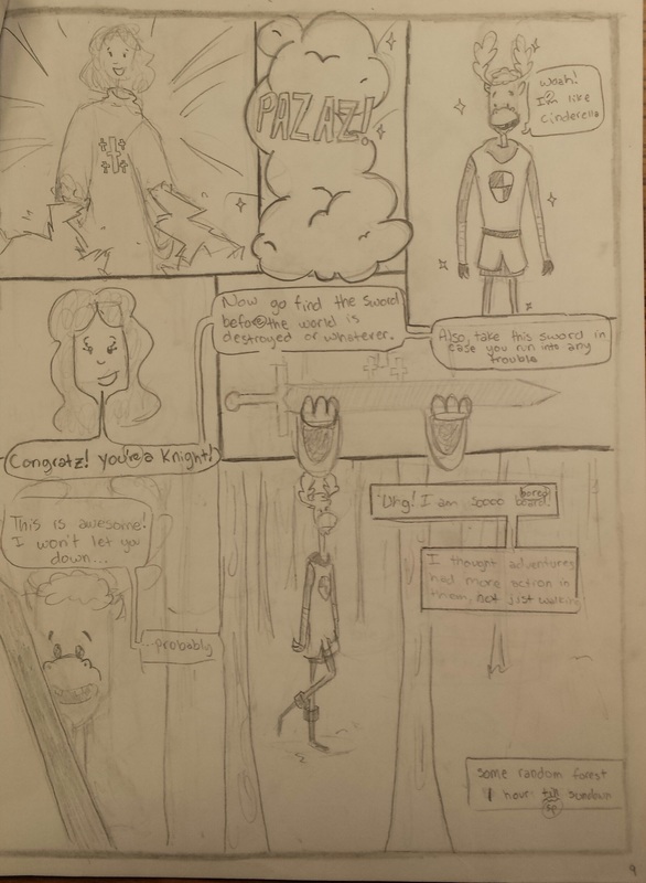
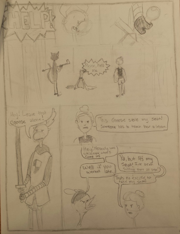
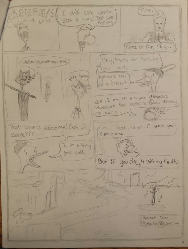
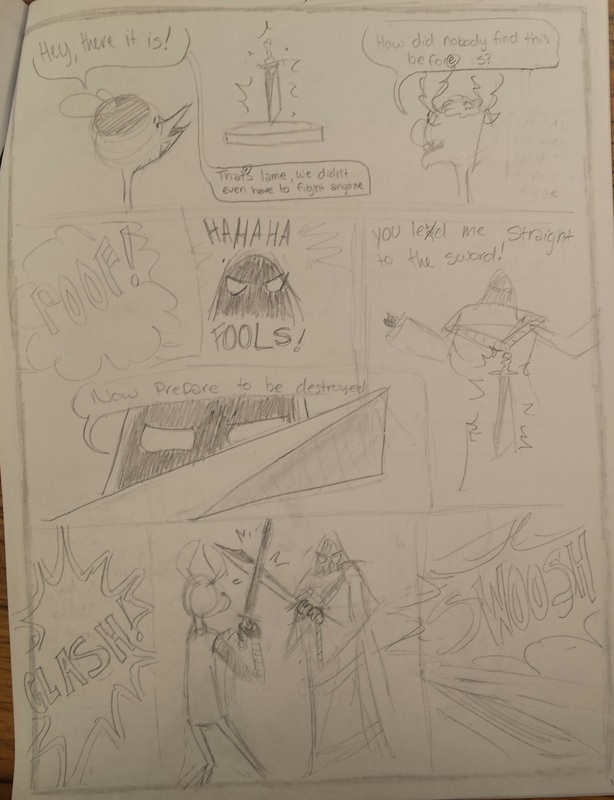
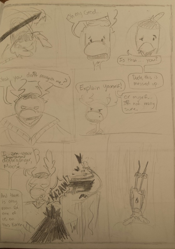
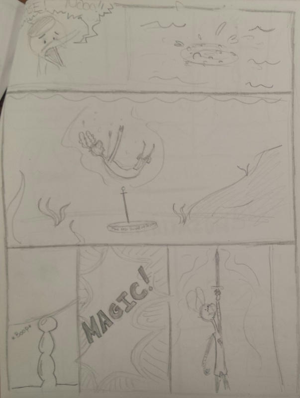
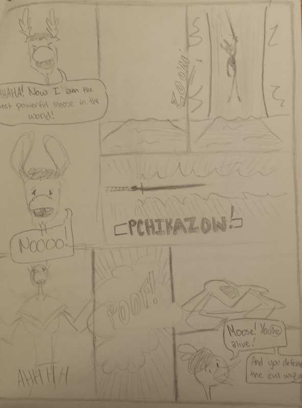
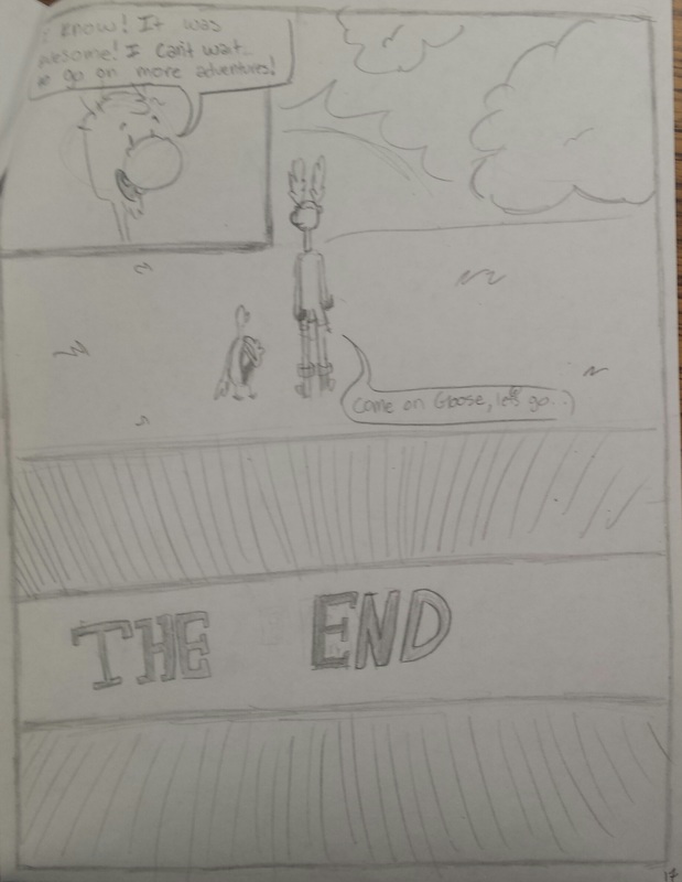
A 17 page graphic novel, that in my opinion took way to long to complete, called "The Adventures of Goose and Moose". Inspired by Mr. Meserve and the rest of my AP Art History class, the novel follows a moose's journey to find the mystic sword of destiny. I made it with a number two pencil and printer paper (very artistic, I know) and mainly focused on the placement of the characters within the paper. A skill I learned was how to repeatedly draw the same character from different angles for multiple scenes. I also learned a lot about anatomy and how to convey a message using "cartoon" body language. The main art elements I used included line, value, and some space for perspective shots.
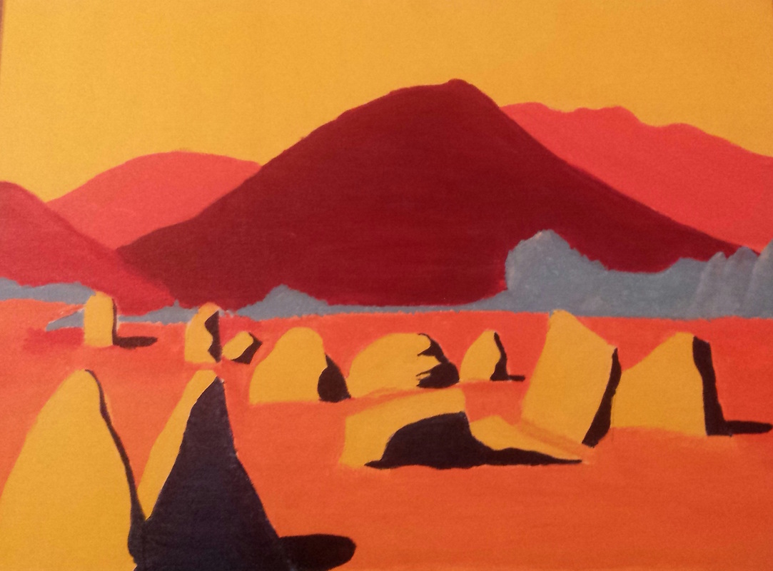 This is an acrylic painting of a landscape. I mainly focused on color and space. I used a dark blue to represent shadows and painted the mountains different colors of red and orange to show space. I do wish I had time to put shadows on the hills, as I think it would have added more form and shape the them. The main skills I learned were how to paint on a canvas and which paintbrushes to use for certain jobs. To me the painting looks like a passive aggressive alien planet with earthly qualities. It does not strike me as "angry", but the colors seem rather in your face and almost overly bright.
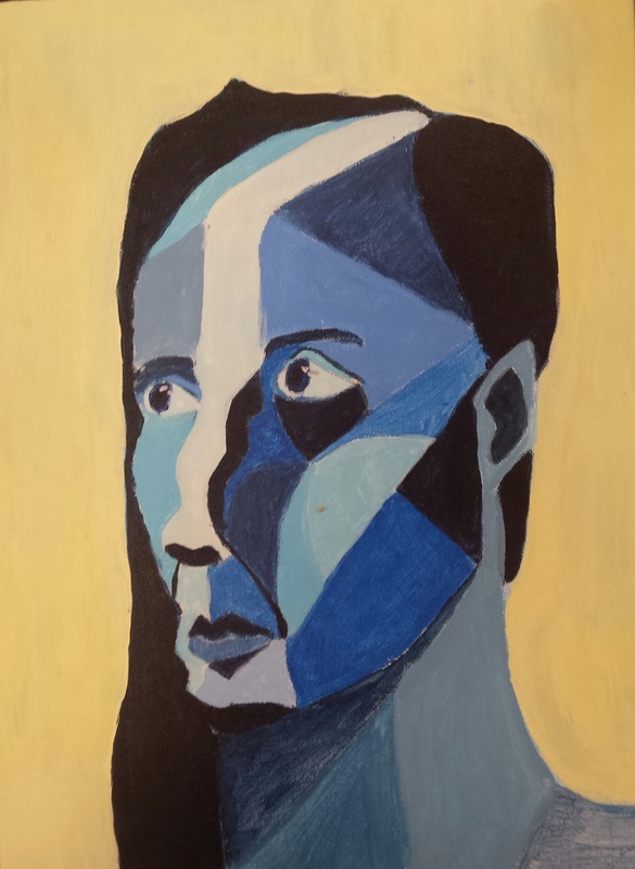 This is my "non traditional" self portrait. At first I was going to do a "bad" portrait, but then decided to go with something more abstract. Some skills I learned, and reinforced, was how to draw a proportional head and how to make something three dimensional. I used the the art principles of color and value to do this. I think the blue adds a calm, but slightly saddening look to the portrait.
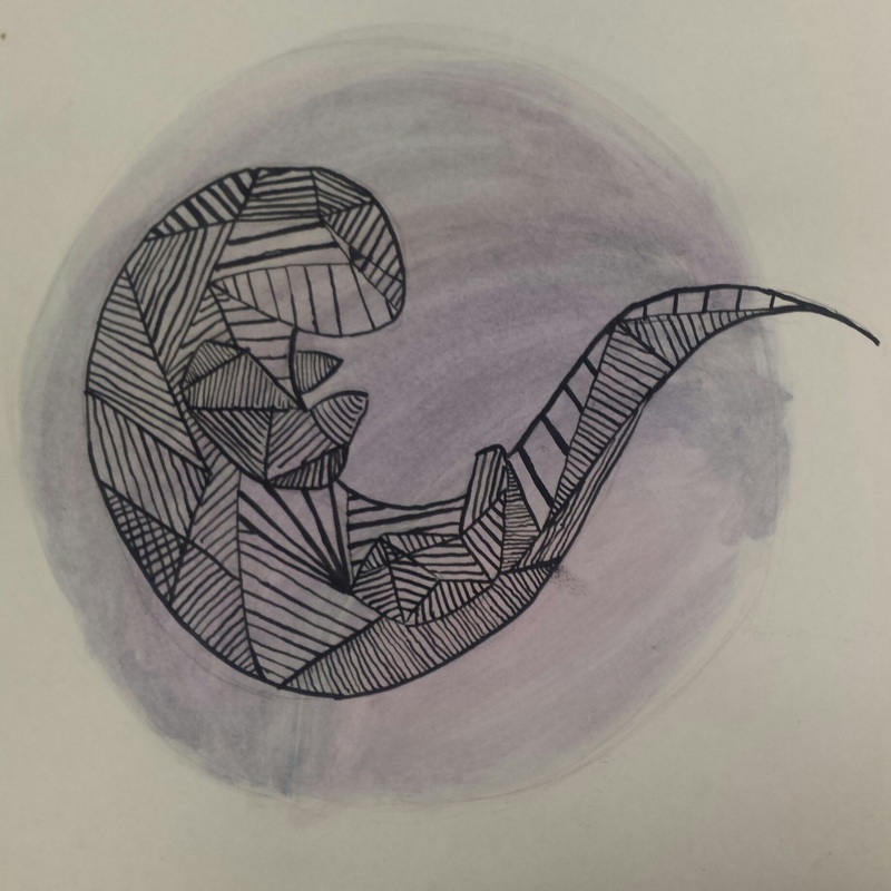 My spirit animal final is an otter. The one skill I learned is how to create value in a two dimensional picture. I used the art elements line and shape to create these values. Lots of small, thin lines define the paws and feet and bring them forward in space. Overall, the drawing feels calming with the blueish purple moon in the background. Also, here's a goose. 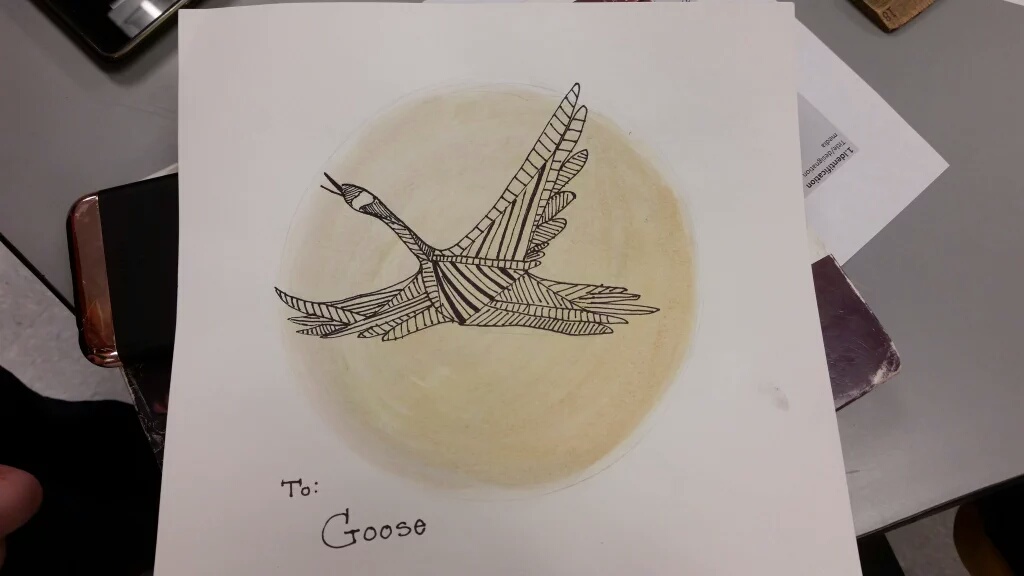 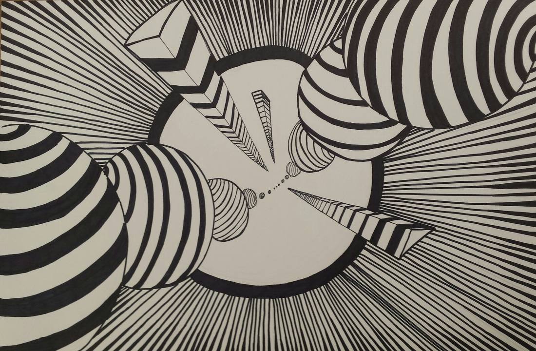 This is my op art piece. One skill I learned was how to include patters to make he drawing more consistent. Instead of including random patterns on the circles, I decided to give them all stripes. The direction of the stripes also gives the circle a three dimensional look to some of them. The main art and design elements I wanted to incorporate were space and movement. I used overlapping and different line thickness to accomplish this. Overall, I think the drawing looks like it is collapsing in on itself (kind of like the big bang, but instead of everything expanding outwards, everything is colliding together).
|
AuthorI love soccer, my favorite color is green, and my spirit animal is a sea otter. Archives
June 2016
Categories |
 RSS Feed
