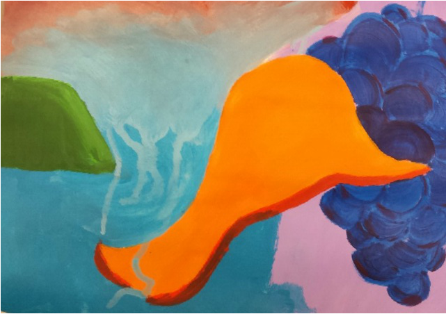
This assignment the "Abstract Painting" project. The goal was to, quite simply, create an abstract painting based off of the rules at www.lordmeserve.weebly.com. I succeeded by following the rules. I didn't have a sketch for this, I was just told to go for it. First, I colored half of the background a light purple (as seen on the right side of the paper). Next i put a green trapezoid on the side of the painting. That's when i decided to put an orange shape in the middle. After that, I put a blue background on the other half of the paper which kind of blended into the red it the top left corner. I wish i could have blended the blue and purple together, but in the moment I didn't really think about it. Next, I just added a bit of red underneath the orange object to give it more shape. I noticed that there wasn't a lot happening on the right side of the paper. To fix this problem, I added dark blue circles with a bit of maroon to fill the space. If I could improve it, i would change the orange shape in the middle. I don't know why but i just feel like she shape is out of place. It was successful (and accomplished the goals) because it followed the rules and it is a unique looking painting.
0 Comments
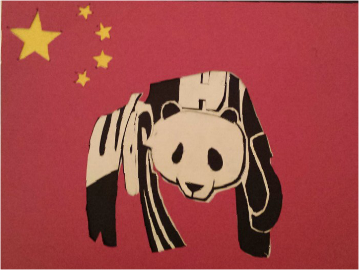
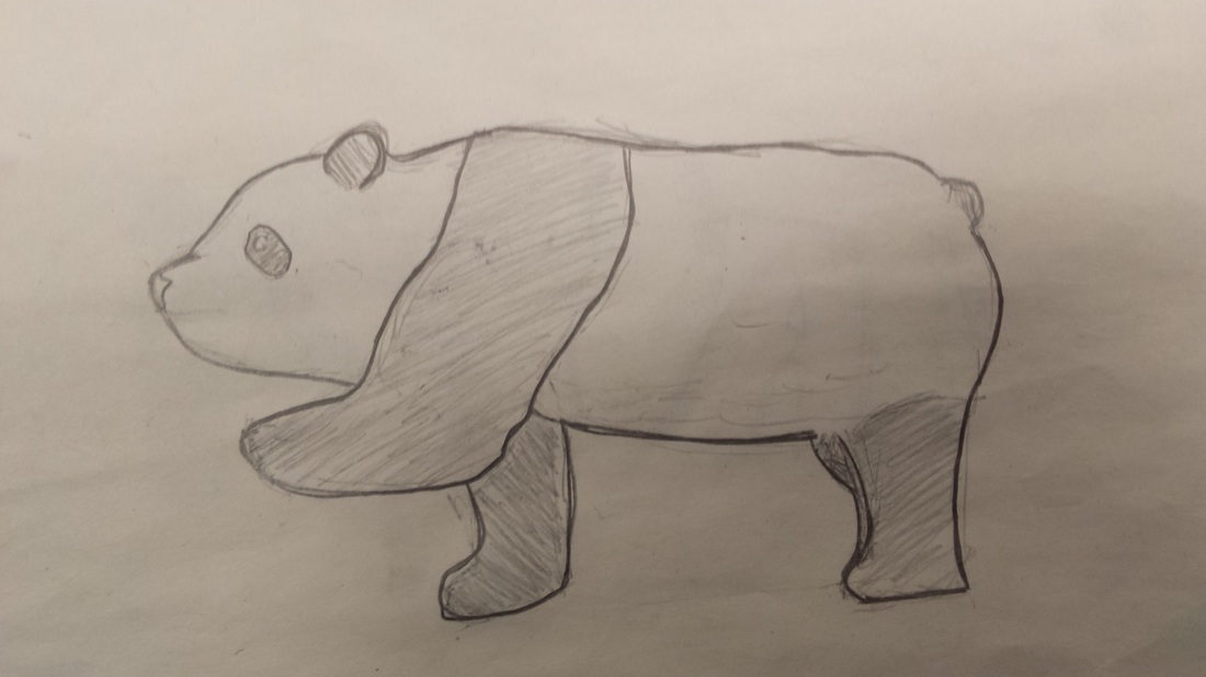
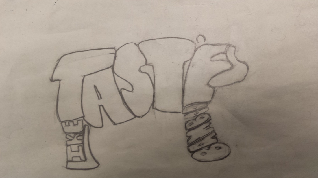
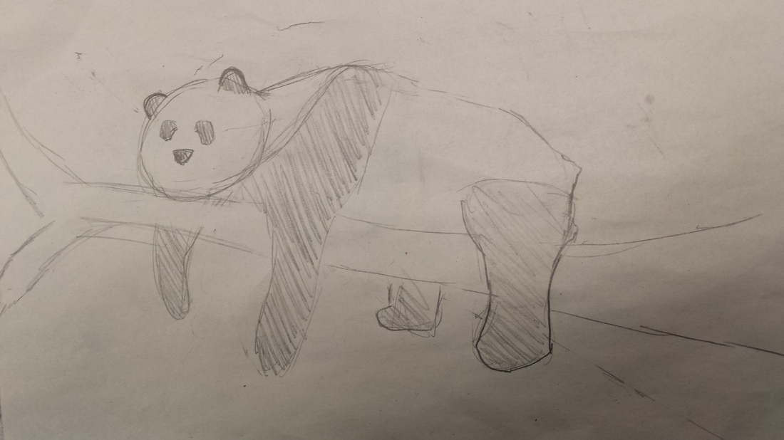
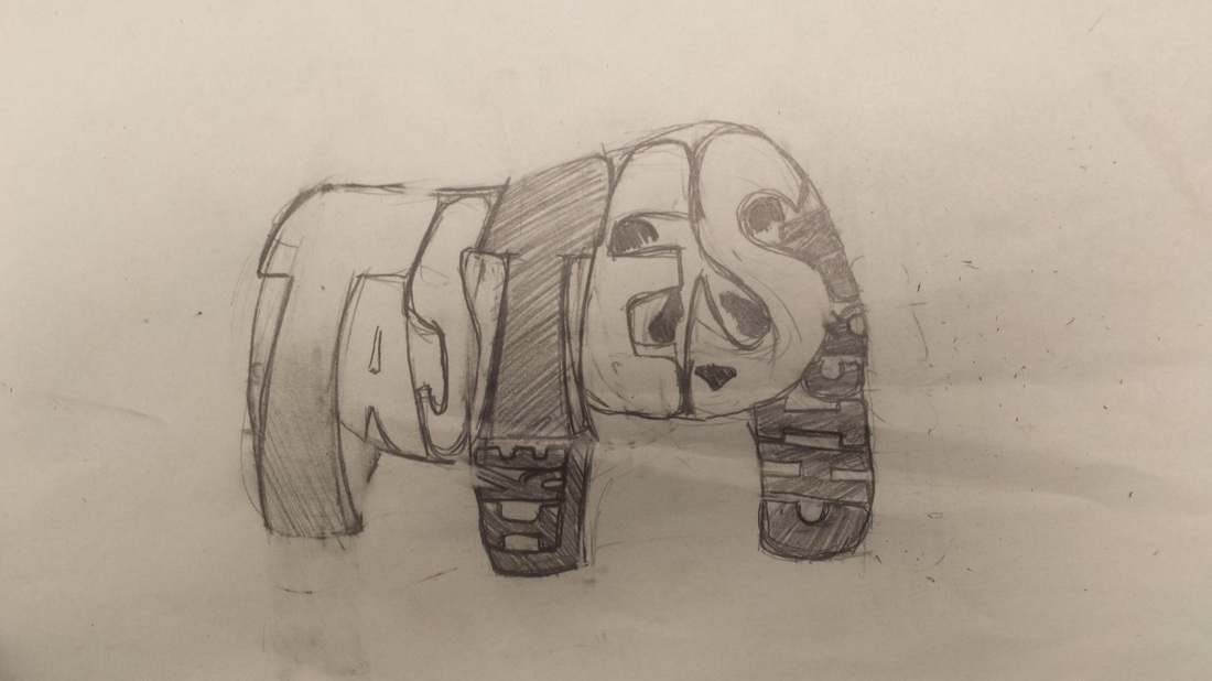
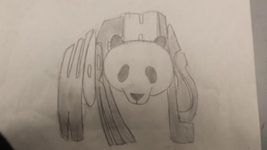
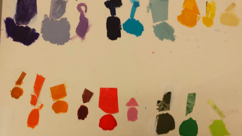
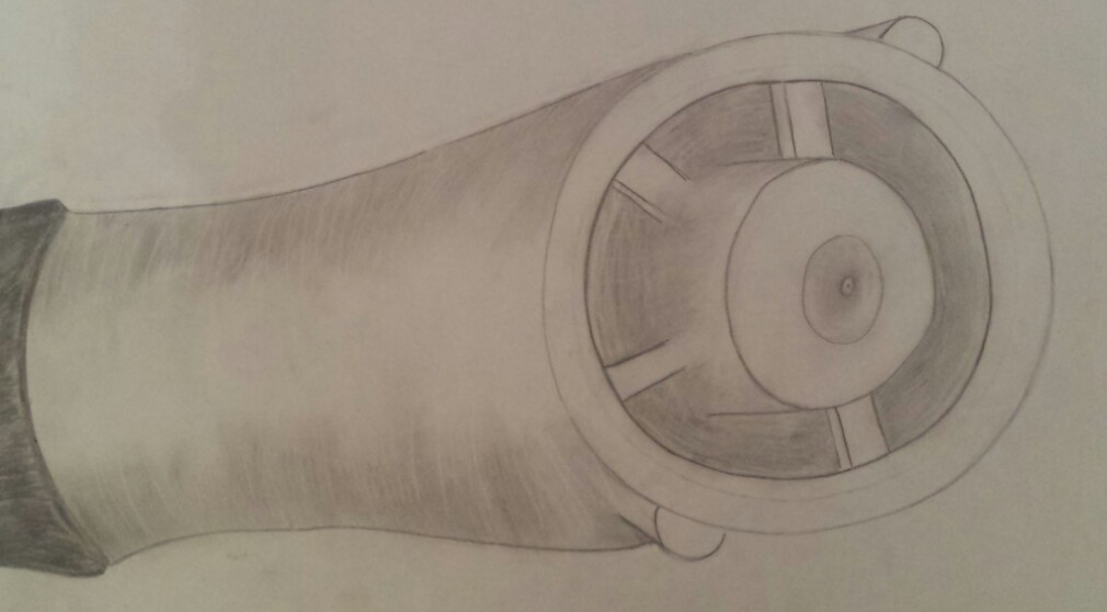
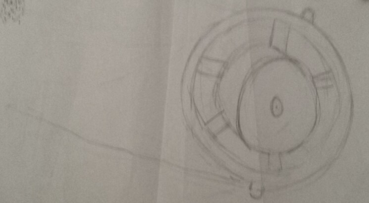
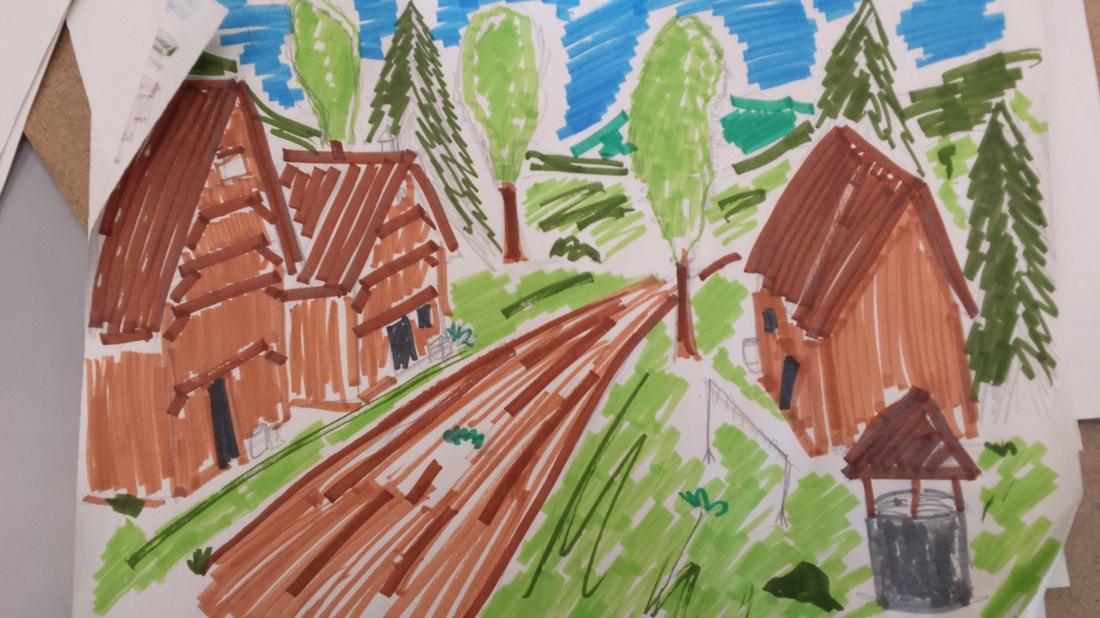
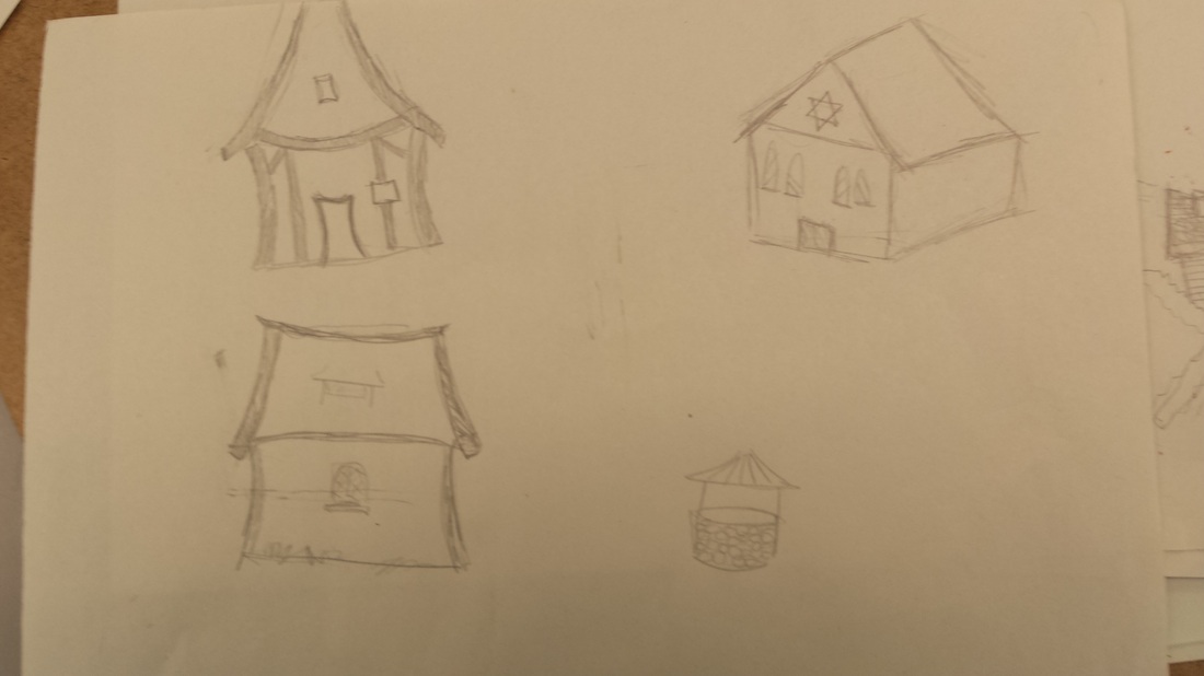
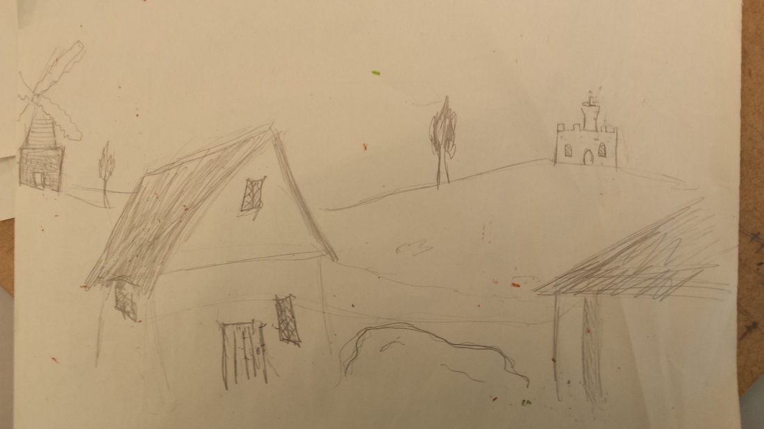
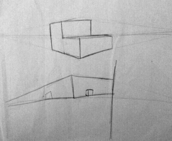
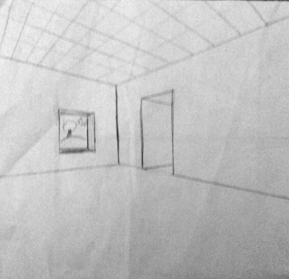
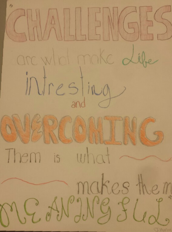
This assignment was the "typography" project. The goal was to create an image out of text. I decided to create the image of a panda out of the word 'worthless' with a Chinese flag in the background. I succeeded by making an image out of a word that can be easily defined. For my first sketch I just practiced drawing a panda. I was trying to get a feel of how to draw a panda. I planed to improve it by adding text and to make it face forward. I got to my second and third sketch by experimenting with what I wanted to say and how to fit it in the space I had. It was more successful because it actually used words to make the shape of a panda. If I could improve it i would have made cleaner cuts with the exact-o knife. I think that the design was successful because you can clearly define the image and the text. 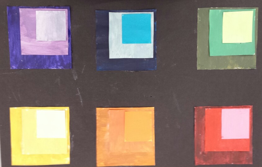 This assignment was the "color matching squares" project. The goal was to match the colors from magazines by mixing paints. I succeeded by carefully getting the colors to look identical. I didn't really have a first sketch, I just started to mix colors. I'm not really sure why, but matching the greens and blues were the hardest. If i could improve it, i would have put on a thicker paint of coat on the squares. It extremely difficult I also would have re-painted the orange because they look similar to each other. The easiest colors to match were the red and yellow. This is probably because they were lighter colors. The final design accomplished the goals by accurately matching most of the colors in the magazines. I think that the design was successful because the colors matches the magazine cut-outs.  This assignment was to draw an object close up. For this project I drew a highlighter. The goal was to zoom in on an object and to make that object look realistic. I succeeded by taking a highlighter and drawing it as I saw it. I came up with my first sketch by drawing different objects. Eventually I chose to do a highlighter and started drawing it at different angles. I tried to accomplish a drawing that meet all of the goals. I plan to improve it by adding more detail and shading. I got to my second and third sketch by actually drawing the highlighter up close and with more detail. It was more successful because I actually meet some of the goals listed above. I could improve it by adding more detail and shading. I could also make cleaner lines. The final design accomplished the goals by being an up close drawing with lots of details.The detail consisted of all the little bumps and indentations in the pen. I even included the grip. I think that the design was successful because, like said before, it accomplished all of the goals. 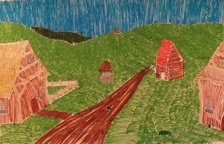 This assignment was to make a backdrop for "The Fiddler on the Roof. The goal was to make a successful backdrop that could be used in the play " The Fiddler on the Rood". I succeeded by looking at types of houses and how people lived back then. I also watched the movie to get a good idea of what it was like (or at least how Hollywood viewed it). I came up with my first sketch just by doodling. I was trying to get an idea of how I wanted the backdrop to look. I was trying to accomplish something that was visually appealing to the eye, but also useful for the play. I plan to improve it by making it more '3D' in a sense. I wanted people to feel like they where in the play, not just watching. I got to my second and third sketch by researching about "The Fiddler on the Roof" and buildings in that time. I also put more details into my second and third design. It was more successful because it had more detail and looked more like a house would at that place and time. I could improve it by adding more houses and concentrating more on the colors i was using (in the third design). The final design accomplished the goals by having the atmosphere, houses, and roads like they would have in Russia in 1905. I think that the design was successful, however it wasn't as good as i wanted it to be. I think that is was successful because of the same reasons above, it used the right aspects for that time and place. However i think that i could have added more houses and forestry, outline in Sharpie, and add a better synagogue. 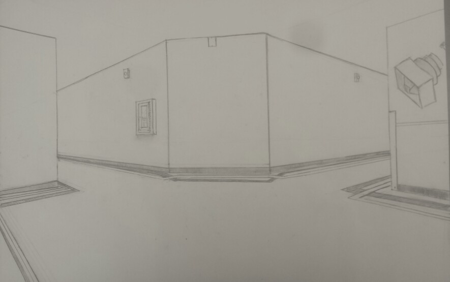 This project was to create a two point perspective drawing on the hallways at MSHS. The goal was to make it look as realistic as possible. To succeed I had to practice drawing two point perspective. I came up with my first sketch by following the instructions on a power point. I was trying to make a 3D looking object that was being looked upon from two angles. I plan to improve it by measuring more precise and adding better parallel lines. I got to my second sketch by experimenting with more shapes (as well as following the power point). I got to my third sketch by practicing drawing a room at 2- point perspective. It was more successful because I used better lines and actually drew a room. I could improve it by making the roof more accurate and add more items into the design. The final design accomplished the goals because it was a 2-point perspective drawing of a hallway that looked like a hallway in Mount Si High School. I think that the design was successful because you can clearly tell that it is the photo hallway in the school. Also, if someone was to look at it,, they would clearly be able to tell that it was a hallway, thus making this project successful.  This assignment was to make a poster with an inspirational quote on it. The goals were that the picture must be inspiring and must have good typography on it. I succeeded by looking up images of typography posters and fonts that could be used in typography. I came up with my first sketch by coming up with a quote and emphasizing the important words. I tried to accomplish making a poster that could catch peoples eyes and make them inspired. I plan to improve it by being more precise with each letter and measuring out how big each letter should be. I got to my second and third sketch by using more kinds of fonts and making it more appealing to the eye. It was more successful because I measured out how big the letters were so they could fit on the page. I also started to work on the fonts so they would reflect what the word was saying better. I could improve it by adding color. The final design I created accomplished the goals simply by following the goals and making all the improvements that were listed above. I think that the design was successful. I think that is was successful because it accomplished all the goals and improvements I wanted. If i could improve it i would wan't to go around the letters with sharpie.  This assignment was to make a logo for our website. We were supposed to make a logo that was 'retro' or old fashioned. To succeed I had to look up pictures of old signs and objects from the 60's so that i could see what retro letters where like. I looked up old toy boxes, gas pumps, and retro signs in general to get and idea of what the theme was going to be. I decided to do something like 'Little House on the Prairie', simple and clean. I plan to improve it by: I got to my second and third sketch by: It was more successful because I: I could improve it by: The final design accomplished the goals by: I think that the design was/wasn't successful: I think that is was/wasn't successful because: 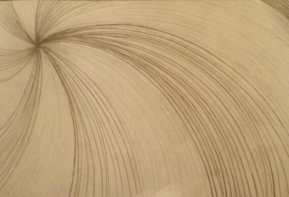
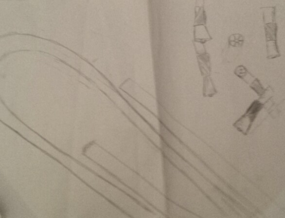
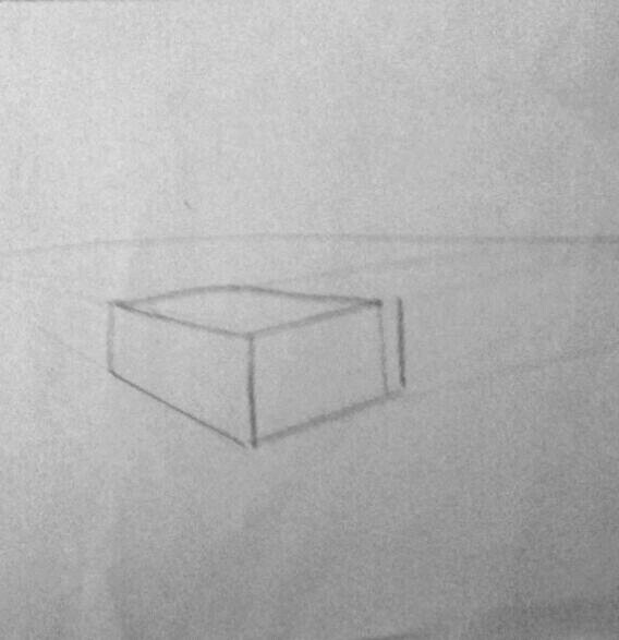
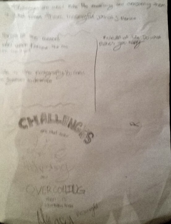
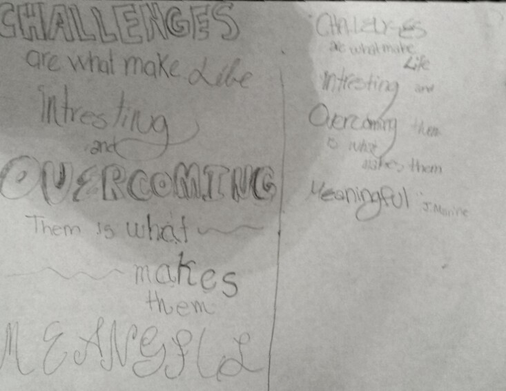
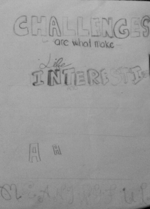
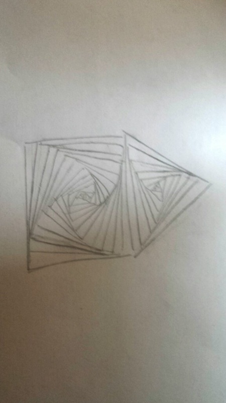
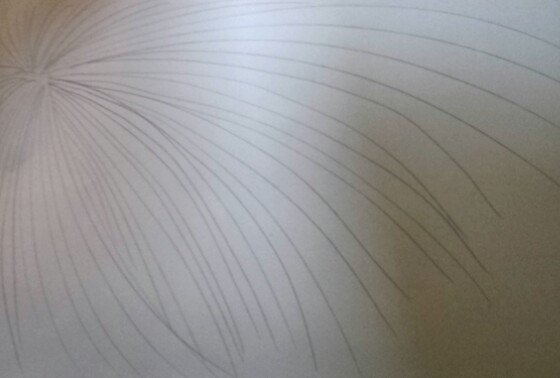
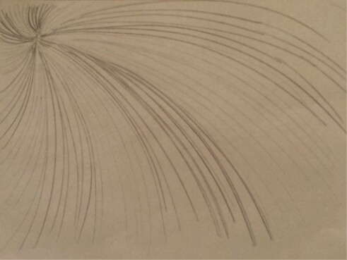
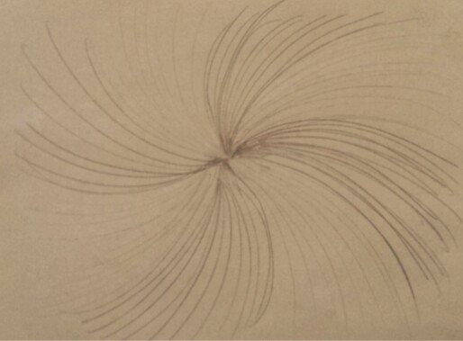
The movement project was made to practice drawing movement so that the eye will follow the drawing in a certain path. For me, coming up with ideas for this was easy, it was getting them down on paper that was hard. Each little line impacts the drawing so much, that to succeed i had to be patient, calm, and precise. For example, because the lines are curving, I had to make sure that the lines were perfectly spaced so that the . My first sketch(photos bellow) inspired me to do the spiral design in my finished project. The beginning art students were doing the 'spiral square' project, and while waiting to hear what my project would be about, I was following along. Ultimately, that simple beginning art project gave me the idea for my project. My second draft wasn't quite what I wanted it to look like. It looked a bit like a firework instead of a spiral coming towards you. Also, you couldn't tell the difference between the spiral parts, thus making me do a "lighter then darker" design. My third design was exactly what I pictured in my head, a spiral design that was a bit off-centered, and had different shades of grey. The first sketch was spiraling inwards, hence how I got the inward spiral idea used in my third and fourth sketch. I did make a fourth design, where the spiral was in the center, but I didn't like the look of it. It felt like I was drawing a "mainstream" spiral instead of something more unique. The final design successfully showed movement. I asked many people to look at the drawing, and to tell me where their eyes went. Most told me that their eyes went from the bottom right of the paper, to the dark area in the top left. Overall this drawing accomplished the goals of the project. |