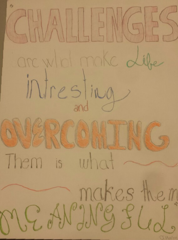
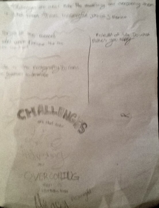
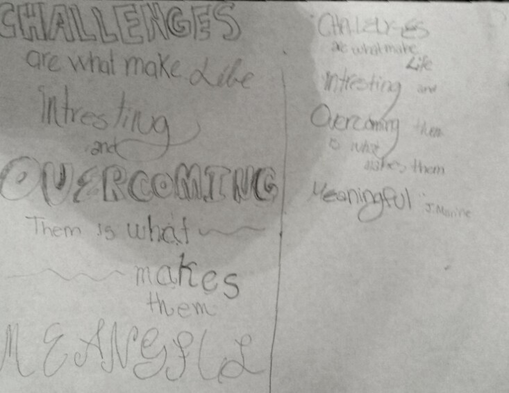
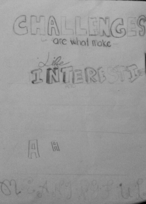
This assignment was to make a poster with an inspirational quote on it. The goals were that the picture must be inspiring and must have good typography on it. I succeeded by looking up images of typography posters and fonts that could be used in typography. I came up with my first sketch by coming up with a quote and emphasizing the important words. I tried to accomplish making a poster that could catch peoples eyes and make them inspired. I plan to improve it by being more precise with each letter and measuring out how big each letter should be. I got to my second and third sketch by using more kinds of fonts and making it more appealing to the eye. It was more successful because I measured out how big the letters were so they could fit on the page. I also started to work on the fonts so they would reflect what the word was saying better. I could improve it by adding color. The final design I created accomplished the goals simply by following the goals and making all the improvements that were listed above. I think that the design was successful. I think that is was successful because it accomplished all the goals and improvements I wanted. If i could improve it i would wan't to go around the letters with sharpie.
0 Comments
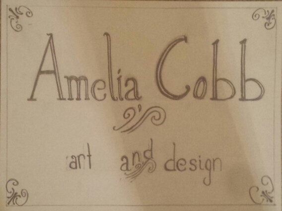
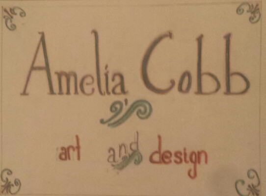
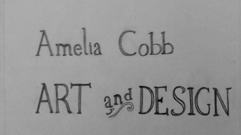
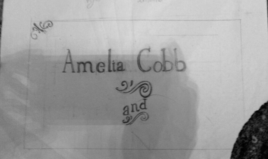
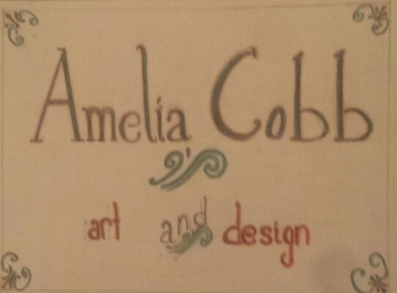 This assignment was to make a logo for our website. We were supposed to make a logo that was 'retro' or old fashioned. To succeed I had to look up pictures of old signs and objects from the 60's so that i could see what retro letters where like. I looked up old toy boxes, gas pumps, and retro signs in general to get and idea of what the theme was going to be. I decided to do something like 'Little House on the Prairie', simple and clean. I plan to improve it by: I got to my second and third sketch by: It was more successful because I: I could improve it by: The final design accomplished the goals by: I think that the design was/wasn't successful: I think that is was/wasn't successful because: 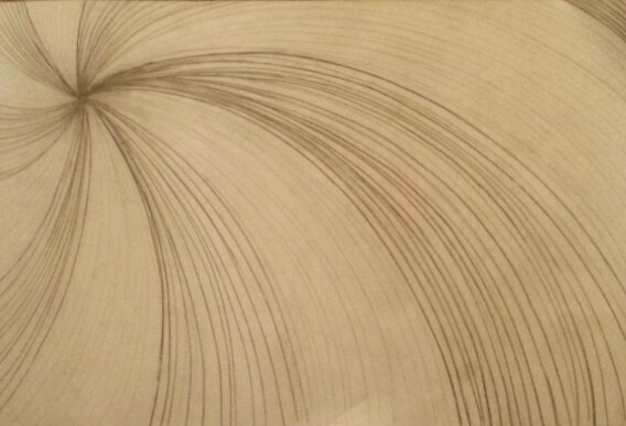
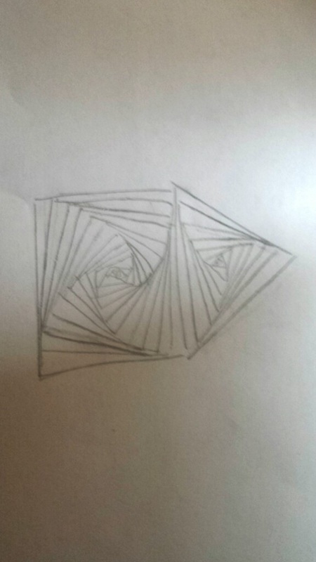
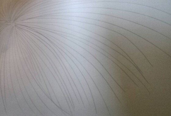
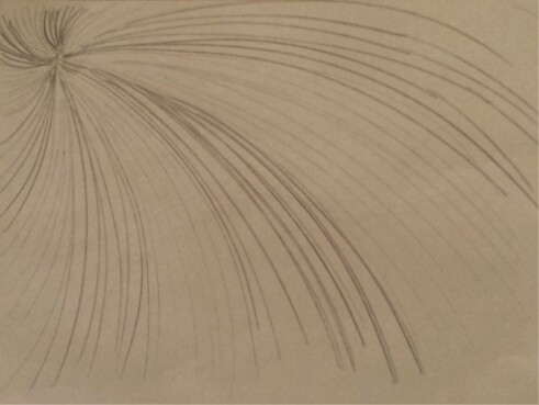
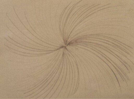
The movement project was made to practice drawing movement so that the eye will follow the drawing in a certain path. For me, coming up with ideas for this was easy, it was getting them down on paper that was hard. Each little line impacts the drawing so much, that to succeed i had to be patient, calm, and precise. For example, because the lines are curving, I had to make sure that the lines were perfectly spaced so that the . My first sketch(photos bellow) inspired me to do the spiral design in my finished project. The beginning art students were doing the 'spiral square' project, and while waiting to hear what my project would be about, I was following along. Ultimately, that simple beginning art project gave me the idea for my project. My second draft wasn't quite what I wanted it to look like. It looked a bit like a firework instead of a spiral coming towards you. Also, you couldn't tell the difference between the spiral parts, thus making me do a "lighter then darker" design. My third design was exactly what I pictured in my head, a spiral design that was a bit off-centered, and had different shades of grey. The first sketch was spiraling inwards, hence how I got the inward spiral idea used in my third and fourth sketch. I did make a fourth design, where the spiral was in the center, but I didn't like the look of it. It felt like I was drawing a "mainstream" spiral instead of something more unique. The final design successfully showed movement. I asked many people to look at the drawing, and to tell me where their eyes went. Most told me that their eyes went from the bottom right of the paper, to the dark area in the top left. Overall this drawing accomplished the goals of the project. |